

Every year around this time, I look forward to seeing which colors the major paint companies choose to represent the year ahead.
While I always enjoy seeing the individual Colors of the Year, what interests me even more is looking at them together and noticing the larger story they tell about where interior design is headed. And already, the 2027 interior color trends are beginning to tell a beautiful story.
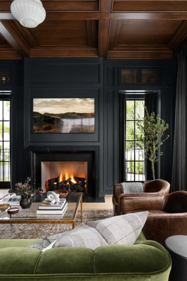 Studio McGee – Benjamin Moore Midnight
Rather than one dominant color family, I’m seeing a move toward nuanced, nature-inspired shades that feel warm, familiar, and wonderfully livable.
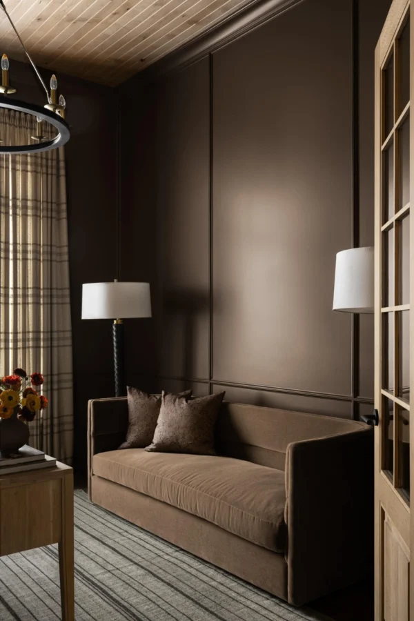 Studio McGee – Sherwin-Williams Sable
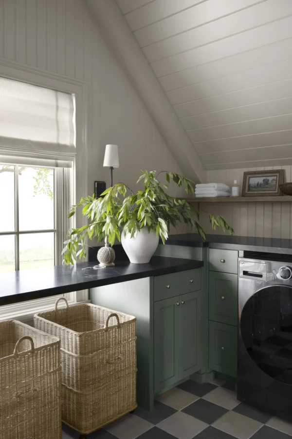
Soft herbal greens, earthy olives, faded blues, sun-warmed neutrals, clay tones, browns, and aubergines are replacing the cooler grays and stark contrasts we saw for so many years.
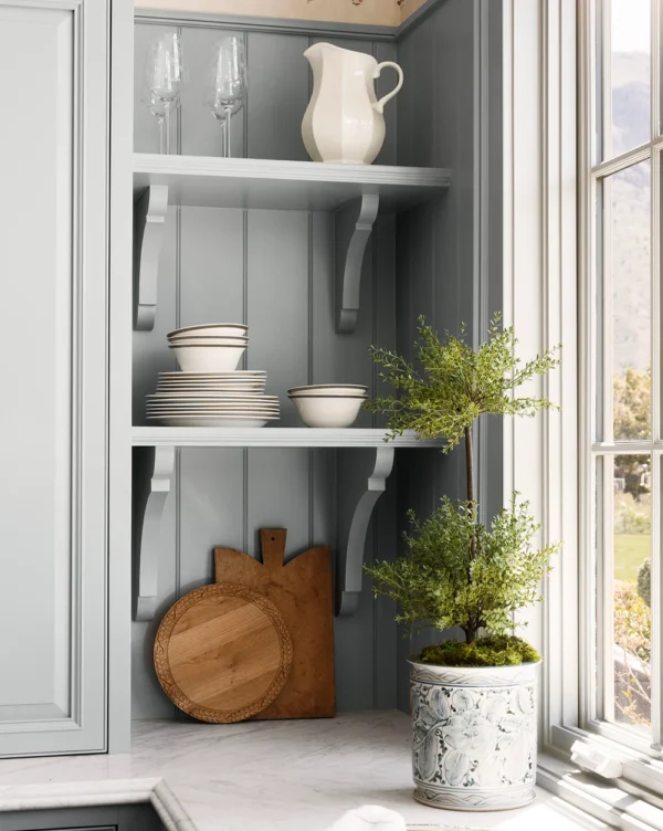 Studio McGee – Topiary – Orchid Pot
And many of these colors are beginning to function almost like neutrals, bringing personality and depth to a room without necessarily demanding attention.
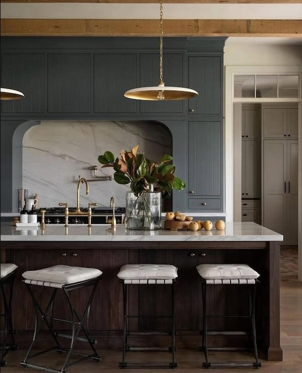 Ali Henrie Design – Lindsay Salazar Photography – pendants
Below, I’m sharing the 2027 Colors of the Year announced so far, along with the larger paint and interior color trends I expect we’ll be seeing everywhere in the coming year.
And I’ll be updating this post when Benjamin Moore and Pantone announce their 2027 Colors of the Year.
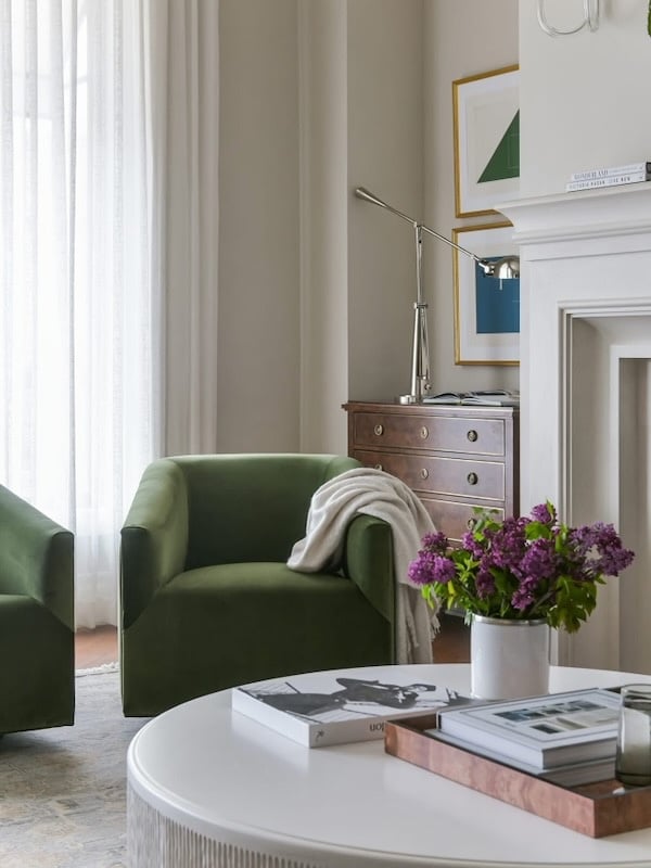 Alice Lane Home – chairs – coffee table
2027 Colors of the Year
Sherwin-Williams 2027 Color of the Year: Celery SW 6421
Sherwin-Williams has selected Celery SW 6421, a soft herbal green with subtle yellow undertones, as its 2027 Color of the Year.

Sitting somewhere between an airy pastel and a more grounded botanical green, Celery feels fresh and uplifting while still being quiet enough to use throughout an entire room.
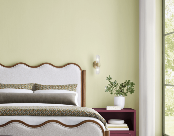 Sherwin-Williams Celery SW 6421
It would be lovely paired with warm white, creamy linen, light oak, woven textures, aged brass, or deeper earthy greens and browns — and I can especially picture it in a bedroom, bathroom, kitchen, sunroom, or cozy reading space.
Sherwin-Williams’ larger 2027 Colormix Forecast, Rewild, takes this idea even further, incorporating earthy neutrals, natural greens, deeper reds, jewel tones, and colors designed to feel less formulaic and more personal.
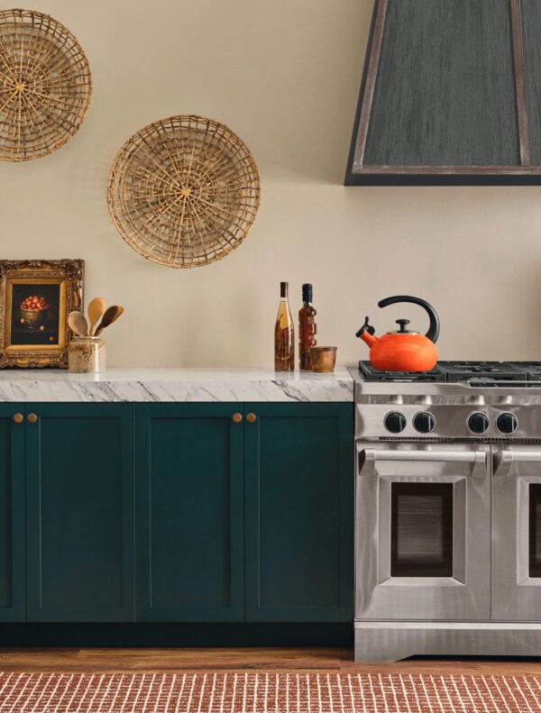 Sherwin-Williams Salty Dog
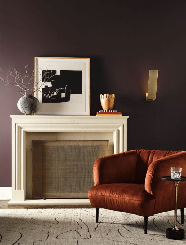 Sherwin-Williams Cordovan
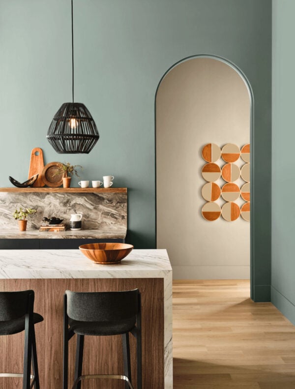 Sherwin-Williams Dutch Tile Blue
Behr 2027 Color of the Year: Grounded T27-01
While Celery represents the lighter side of the green family, Behr’s Color of the Year, Grounded T27-01,shows us its richer, earthier counterpart.
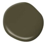
Grounded is a mossy olive green with subtle brown undertones, giving it the depth of a statement color along with the versatility we normally associate with a neutral.
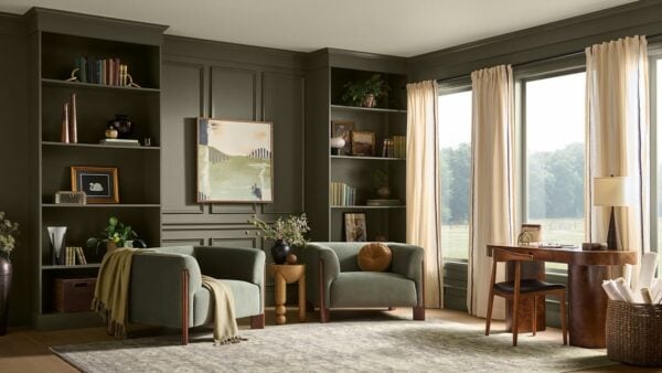 Behr Grounded T27-01
I love the idea of using Grounded on kitchen cabinets, built-ins, a home office, dining room, bedroom, or even throughout an entire color-drenched room.
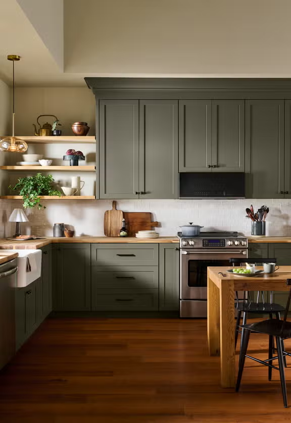 Behr Grounded T27-01
Paired with creamy whites, warm woods, natural stone, linen, leather, or aged metals, it feels sophisticated without being overly formal — exactly the sort of relaxed richness I think we’ll see in interiors throughout 2027.
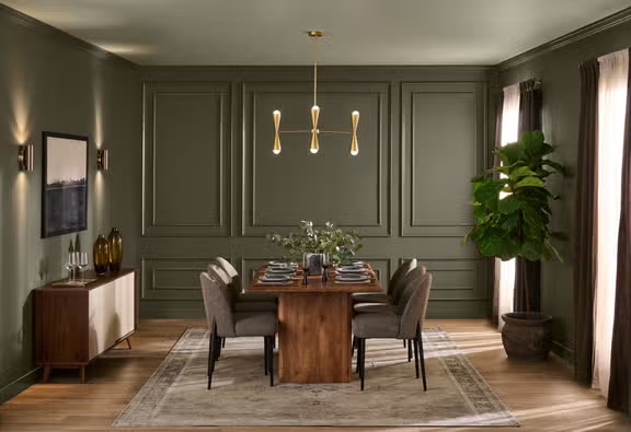 Behr Grounded T27-01
Behr paint is available at The Home Depot.
Valspar 2027 Color of the Year: Cottage Door 8004-38E
Valspar took a different route for 2027, selecting Cottage Door 8004-38E, a softened mid-tone blue with both warm and cool undertones.
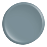
Rather than feeling crisp, coastal, or overtly blue, Cottage Door has a slightly grayed quality that gives it a familiar, timeless feeling.
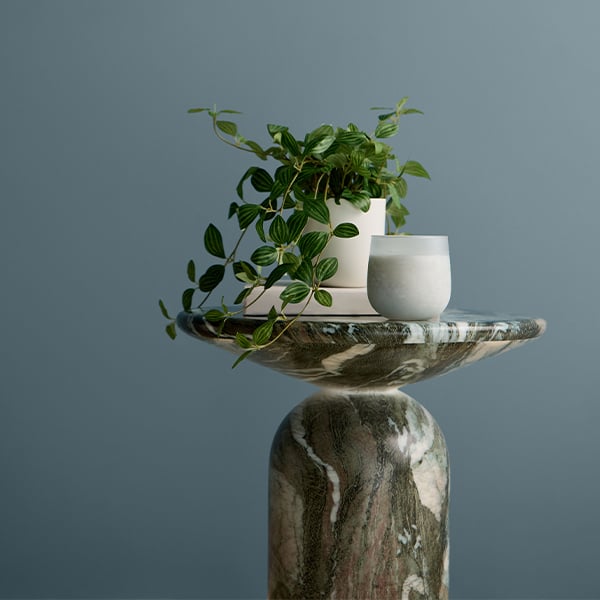 Valspar Cottage Door 8004-38E
I especially love Cottage Door paired with warm ivory, light oak, muted green, soft blush, warm metal finishes, and natural woven textures.
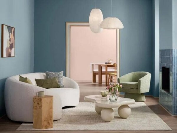 Valspar Cottage Door 8004-38E
It’s a beautiful reminder that blue is becoming softer and more complex again — less about creating a specific decorating theme and more about adding character and atmosphere to a room.
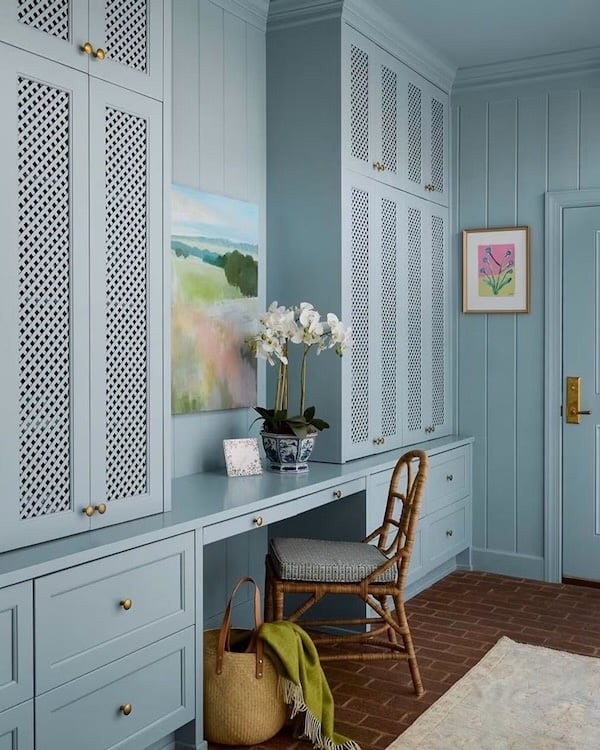 Scout & Nimble – Lauren Robbins Interiors – Lacey Sombar Photography – chair
Valspar paint is available at Lowe’s.
Benjamin Moore 2027 Color of the Year: Coming in October
Benjamin Moore’s 2027 Color of the Year and accompanying Color Trends palette will be announced in October, so I’ll be updating this post as soon as the news is released.
Benjamin Moore’s annual selections are among the announcements I look forward to most, in part because their accompanying palettes tend to offer such a thoughtful look at the relationship between fashion, art, culture, and interior design.
Rather than trying to predict their choice, I’m going to wait for the official announcement — but it will be interesting to see how their 2027 palette relates to the softened greens, blues, warm neutrals, and richer heritage tones already emerging for the year ahead.
Farrow & Ball: The Color Direction I’m Watching for 2027
Farrow & Ball tends to approach color somewhat differently from the traditional Color of the Year format.
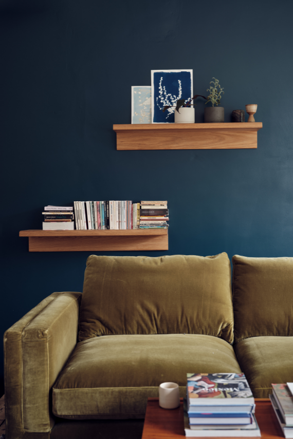 Farrow & Ball Hague Blue
Rather than focusing on one headline shade, their color experts frequently emphasize hues that feel current but still have the depth and timelessness to remain beautiful well beyond a single trend cycle.
Recent guidance from Farrow & Ball points toward earthy greens, oatmeal neutrals, complex browns, and heritage reds — hues that feel as though they could have been part of a home for decades.
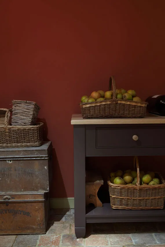 Farrow & Ball Picture Gallery Red
Farrow & Ball is also helping move paint application beyond simple color drenching toward what they call “gradient layering,” using different strengths, finishes, or related shades from the same color family to create subtle transitions and architectural depth.
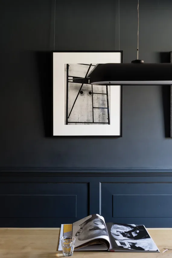 Farrow & Ball Railings
Pantone 2027 Color of the Year: To Be Announced
Pantone has not yet announced its 2027 Color of the Year, so I’ll add their selection to this post when it is officially revealed later this year.
Pantone’s announcement typically adds another interesting perspective because its influence extends beyond paint and interiors into fashion, product design, graphic design, beauty, and other creative industries.
I’ll update this section as soon as Pantone’s 2027 Color of the Year is announced.
The Biggest Interior Color Trends for 2027
Looking beyond the individual Colors of the Year, several larger themes are beginning to emerge, and they give us a much better idea of how color will actually look and feel in our homes in 2027.
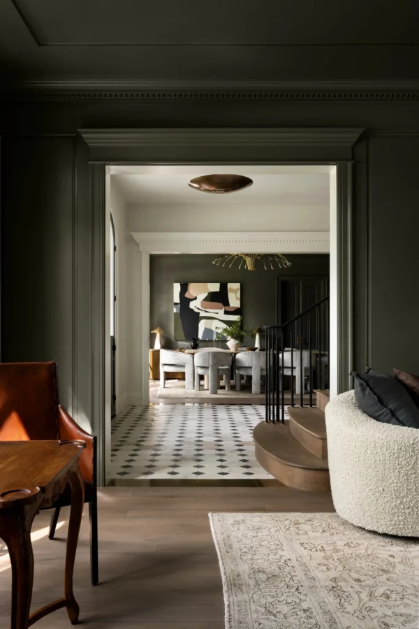 Studio McGee – Otter by Segreto Finishes
1. Green Is Becoming a True Neutral
Green has been gaining momentum for several years, but I think 2027 could be the year we stop thinking of it as a trend color altogether.
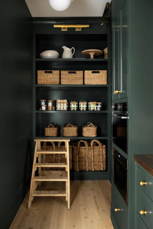 Studio McGee – Inspiration by Portola Paints
Sherwin-Williams’ Celery and Behr’s Grounded beautifully demonstrate the range we’re seeing, from pale herbal green to deep mossy olive.
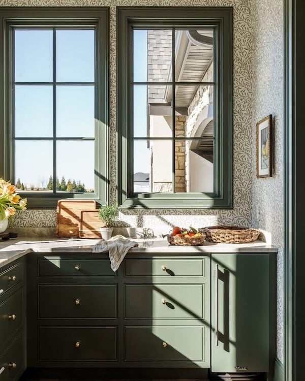 Scout & Nimble – Matthew Anderson Photography
These aren’t the bright botanical greens of years past.
They’re softer, earthier, and often mixed with gray, brown, or yellow undertones, allowing them to work almost like traditional neutrals.
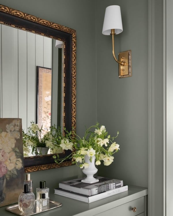
Sage, moss, eucalyptus, celery, olive, laurel, and khaki green all work beautifully with the natural wood, stone, linen, woven fibers, vintage furniture, and aged metals that are also shaping current interiors.
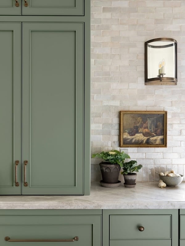 Studio McGee – Card Room Green by Farrow & Ball
2. Soft Faded Blues Are Returning
Valspar’s Cottage Door is an early indication that blue is moving in a quieter direction for 2027.
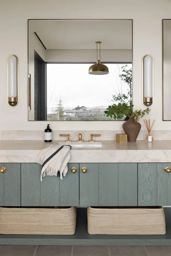
Rather than bright coastal blues or cool blue-grays, we’re seeing faded denim, smoky blue, powder blue, slate, and softly weathered blue-green tones.
 Studio McGee – Amy Neunsinger Photography – McEwan Custom Homes – Broadbent Architectural Studio
For those of us who will always love blue (and I’m definitely in that group) I think this softer approach makes blue particularly easy to incorporate into timeless interiors.
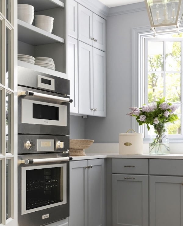 Bria Hammel Interiors – Spacecrafting Photography – lantern pendant
3. Warm Neutrals Continue to Evolve
The move away from cold gray isn’t exactly new, but the neutral palette continues to become warmer, richer, and more interesting.
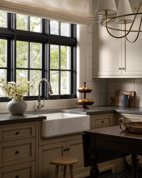 Studio McGee – stool – tiered bowl
For 2027, look for shades of mushroom, putty, oatmeal, warm taupe, parchment, sand, clay, tobacco, blush-beige, and soft brown.
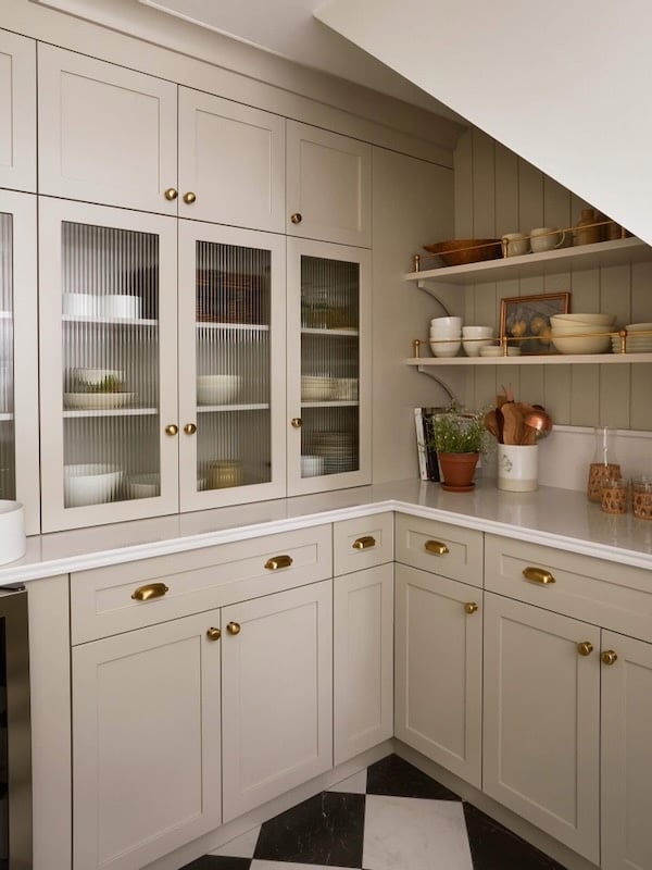 AKB Design Studio – Sylvie Li Photography
Rather than disappearing into the background, these warm neutrals add subtle atmosphere to a space.
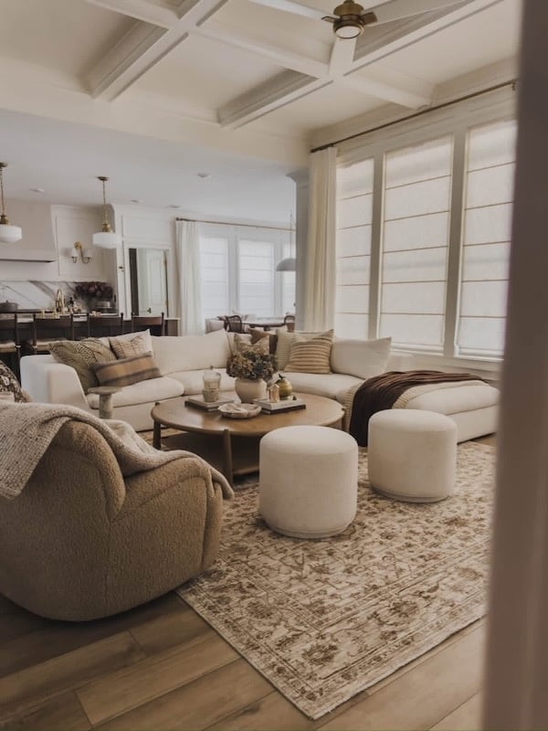
And because they work so beautifully with warm wood tones, marble, limestone, plaster, linen, boucle, brass, and antique finishes, they fit naturally within everything from modern coastal and organic modern interiors to traditional, transitional, European-inspired, and English country homes.
 Similar paint color Sherwin-Williams Accessible Beige – similar pendant
4. Browns, Burgundy, Aubergine, and Heritage Reds Add Depth
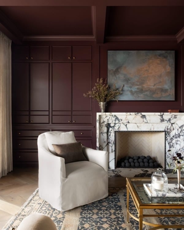
At the opposite end of the spectrum from Celery and Cottage Door, we’re also seeing a growing appreciation for deeper, more historical colors like chocolate brown, oxblood, burgundy, aubergine, plum, brick red, and pomegranate.
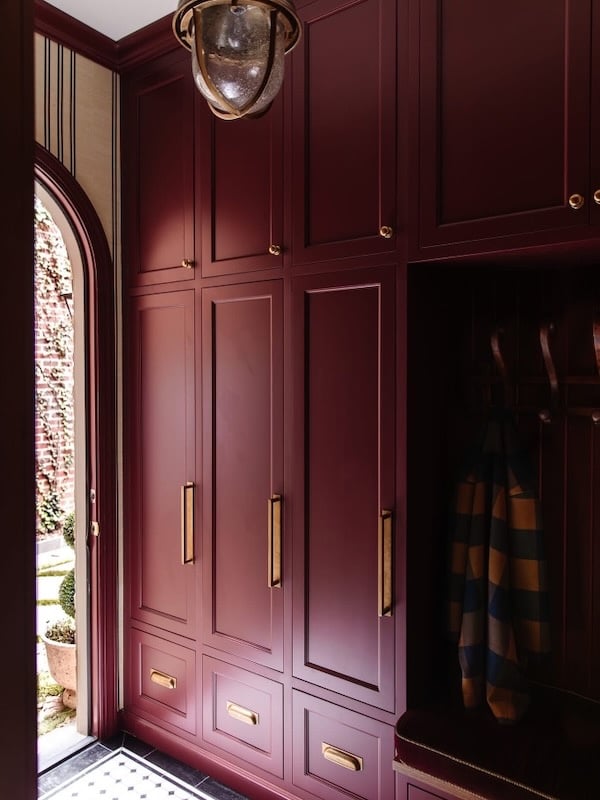
These colors are all appearing in 2027 forecasts and designer predictions and work especially well in dining rooms, libraries, home offices, powder rooms, cabinetry, and spaces where you want a little more drama.
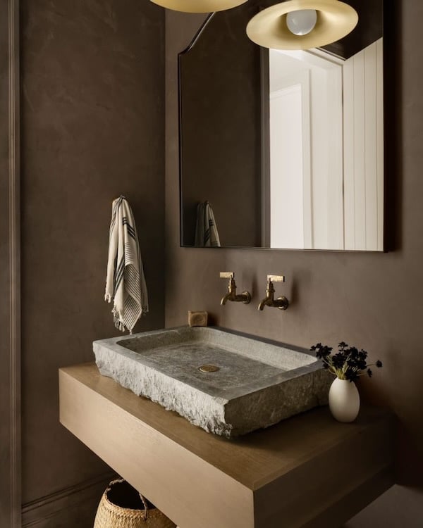
What keeps them feeling current is the way they’re not being paired with black and crisp white, but with softer hues such as pale blue, olive, ochre, warm cream, muted pink, and natural wood.
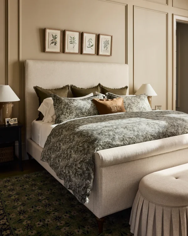 Studio McGee – duvet cover – bed – bench
The result feels layered and sophisticated rather than overly formal.
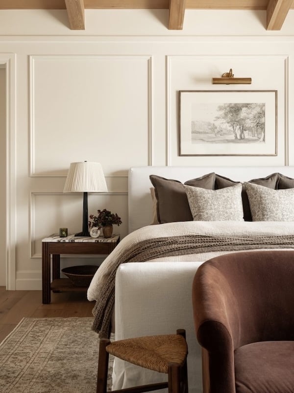 Studio McGee – similar artwork – settee
5. Sun-Faded Color Feels Fresher Than Perfect Color
Another theme I find especially beautiful is the move toward colors that appear slightly faded, chalky, dusty, or weathered.
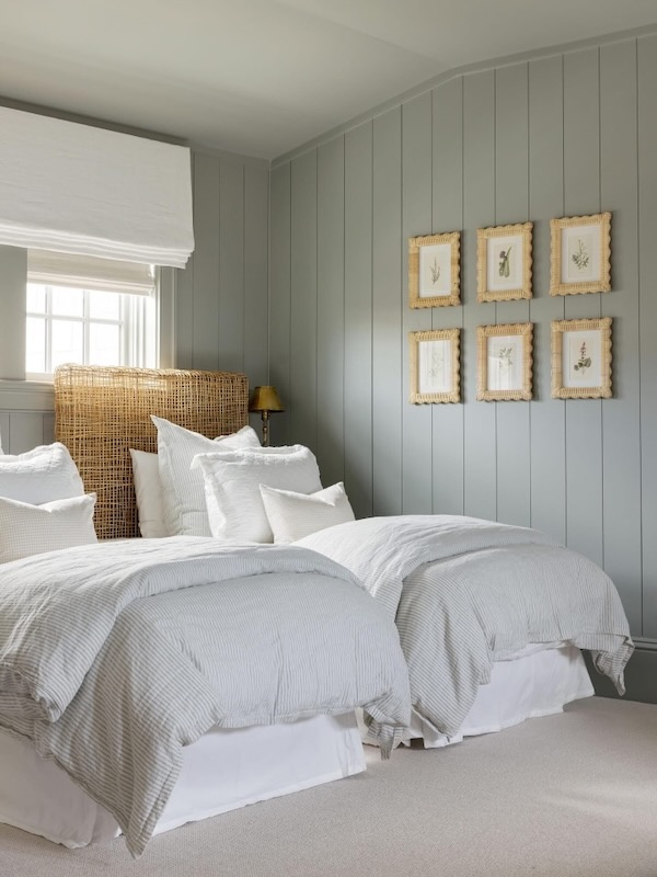 Bria Hammel Interiors – Spacecrafting Photography
Think of an old linen textile, a faded botanical print, aged pottery, sun-washed shutters, or a vintage rug.
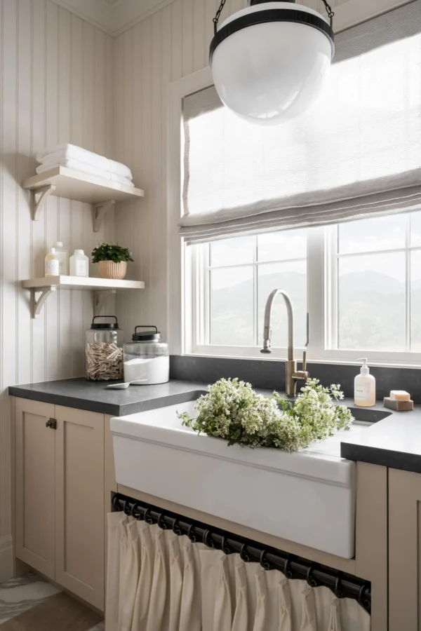 Studio McGee – Sherwin-Williams Sand Beach
This softened quality helps colors feel timeless and easy to live with and brings a sense of history to newer homes.
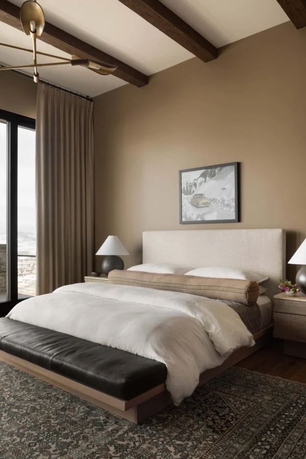 Studio McGee – Coriander Seed by Benjamin Moore
Color Drenching Is Still Here, But It’s Evolving
Color drenching — painting the walls, trim, doors, millwork, and sometimes the ceiling in one color — isn’t disappearing in 2027. In fact, it’s becoming more sophisticated.
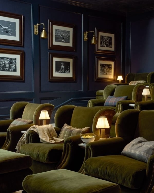
A color-drenched space can make a small room feel intentional rather than chopped up by contrasting trim.
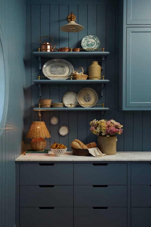 AKB Design Studio – Sylvie Li Photography
While in a larger room it can create a beautifully enveloping effect.
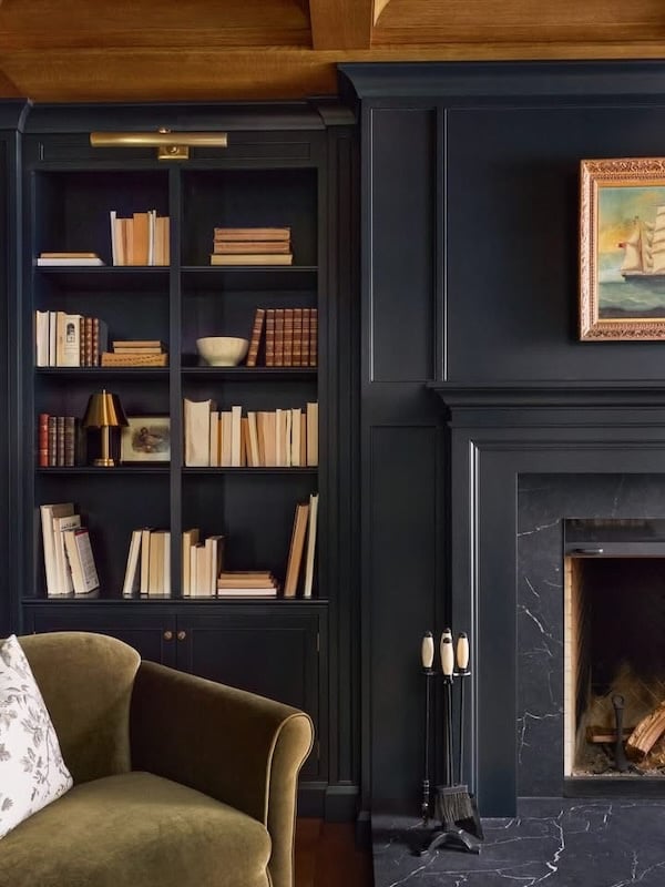 AKB Design Studio – Sylvie Li Photography
However, we’re also beginning to see a couple of variations on this idea, both adding more dimension.
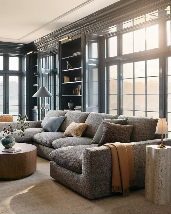
One is double drenching, which uses two closely-related colors rather than relying on a single hue.
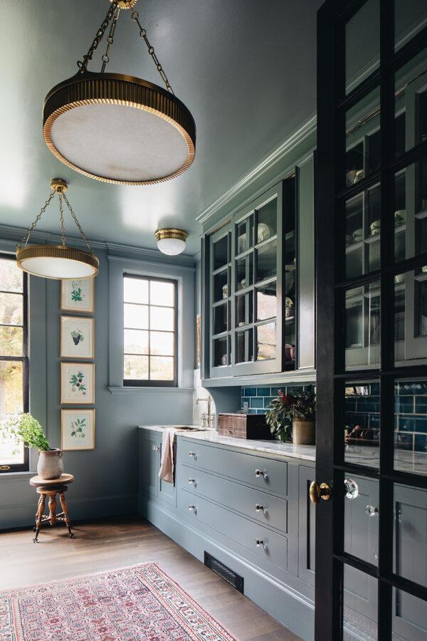 Jean Stoffer Design – chandeliers – similar chandeliers
Another is gradient or tonal layering, where several shades from the same color family move from deeper to lighter throughout a space.
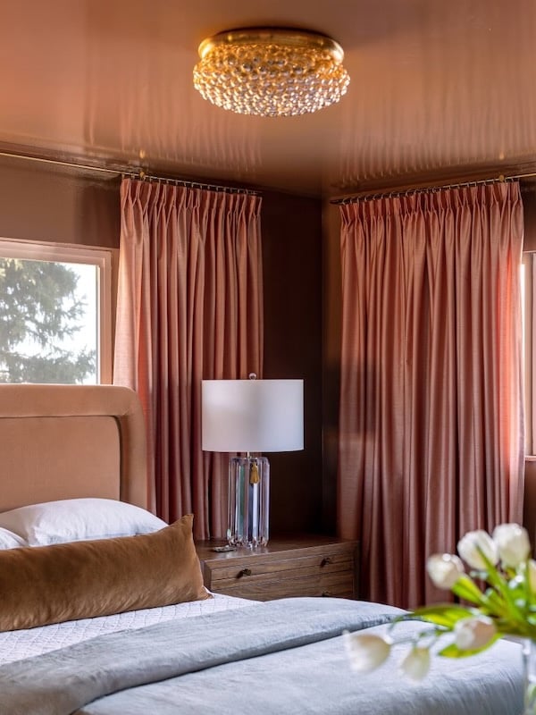
I think we’ll also continue seeing ceilings treated as a true fifth wall rather than automatically being painted white.
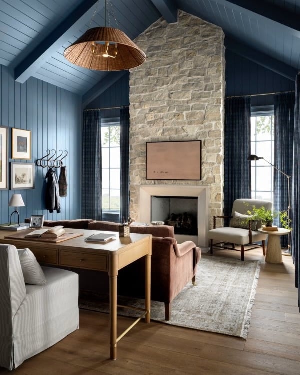
Sometimes that means carrying the wall color overhead, perhaps in a glossy finish. Other times, it might mean using a lighter or deeper version of the wall color to create subtle contrast.
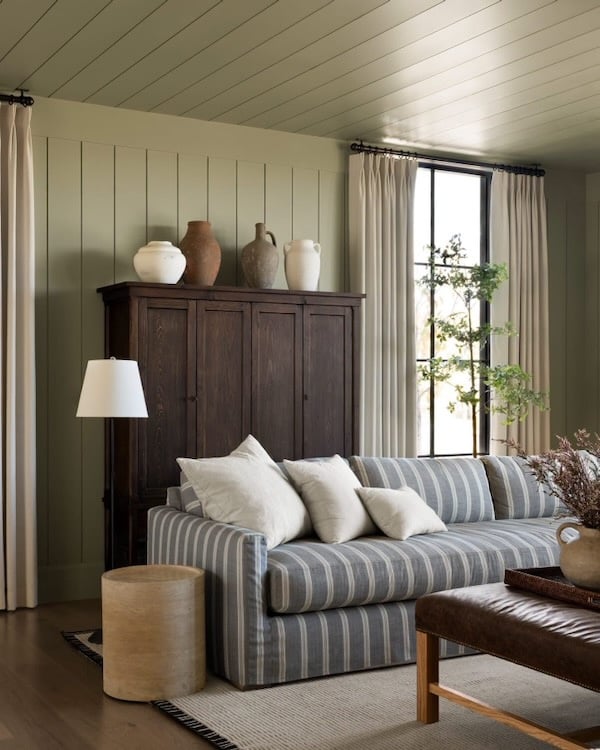
Paint Is Moving Beyond the Walls
Another shift I love is that homeowners are becoming more comfortable using color on cabinetry, doors, built-ins, bookcases, ceilings, fireplace surrounds, and architectural details.
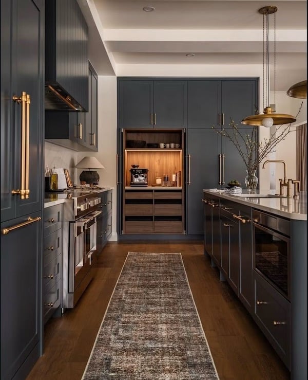 West of Main – Justin Thomason Photography
For anyone who isn’t ready to paint an entire room green or blue, this can be a wonderful way to experiment.
And, in many cases, these smaller applications actually make the architecture feel more intentional.
Matte, Plaster-Like, and Textural Finishes
The conversation around paint is also becoming as much about finish and texture as color.

Soft matte surfaces, mineral finishes, limewash effects, murals, stone, and plaster-like walls complement the earthy 2027 palette particularly well because they allow light and shadow to become part of the color story.
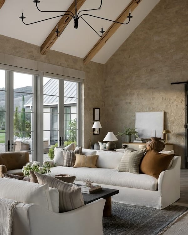 Studio McGee – sofas – rug – chandelier
Rather than every wall appearing perfectly flat and uniform, variations in paint finish can make even a simple neutral feel layered and special.
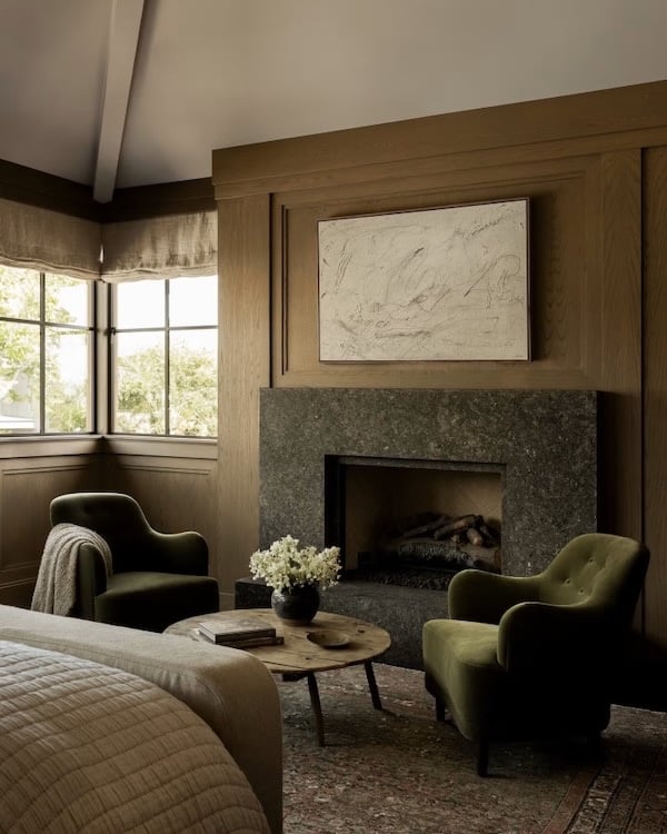 Amber Lewis – Eric Olsen Design Architecture – Shade Degges Photography
How to Use 2027 Color Trends Without Making Your Home Feel Trendy
For me, these Color of the Year forecasts are much more useful as inspiration than instruction.
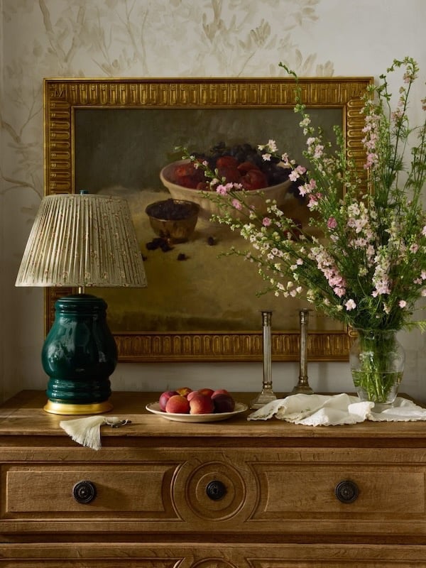 Studio McGee – Amy Neunsinger Photography
If you already love blue, perhaps Cottage Door will encourage you to try a slightly grayer, more muted version.
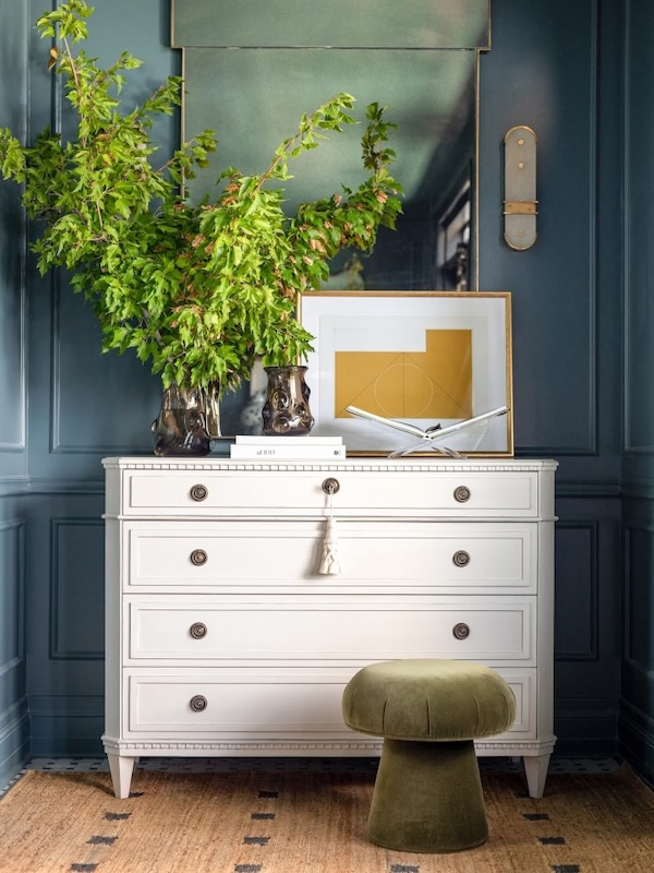 Alice Lane Home – mushroom ottoman – similar ottoman – entry chest
If you’ve always decorated with neutrals, Celery might inspire you to treat pale green as a neutral rather than an accent.
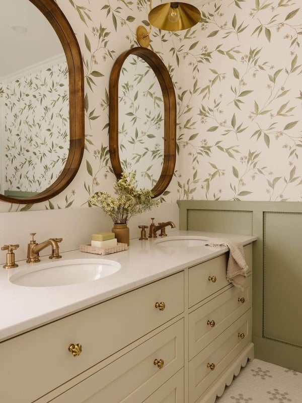 AKB Design Studio – Photographie Interieure Co
And if your home feels as though it needs more depth, Grounded, chocolate brown, or aubergine might be just what’s missing.
The best color palette is always the one that works with your home, your natural light, your existing finishes, and the colors you genuinely enjoy living with.
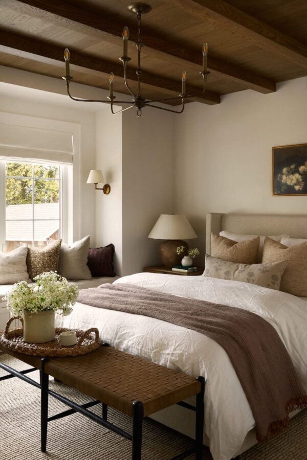 AKB Design Studio – chandelier – bench
And, as I always recommend, test any paint color in your own space before committing.
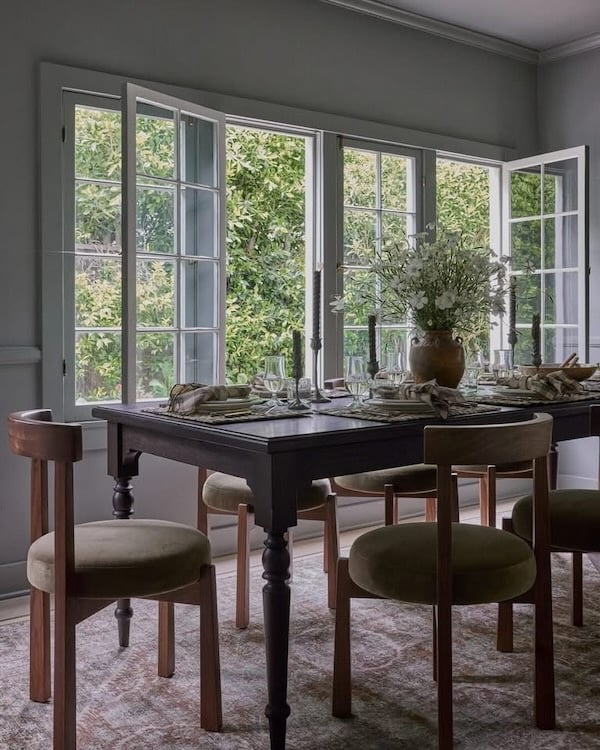
Light exposure, flooring, countertops, furnishings, and even the landscape outside your windows can dramatically affect how a color looks throughout the day. (In summer, our living room and dining room take on a green cast.)
My Take on the 2027 Color Story
If I had to sum up the 2027 interior color trends in just a few words, I would describe them as natural, nuanced, nostalgic, and personal.
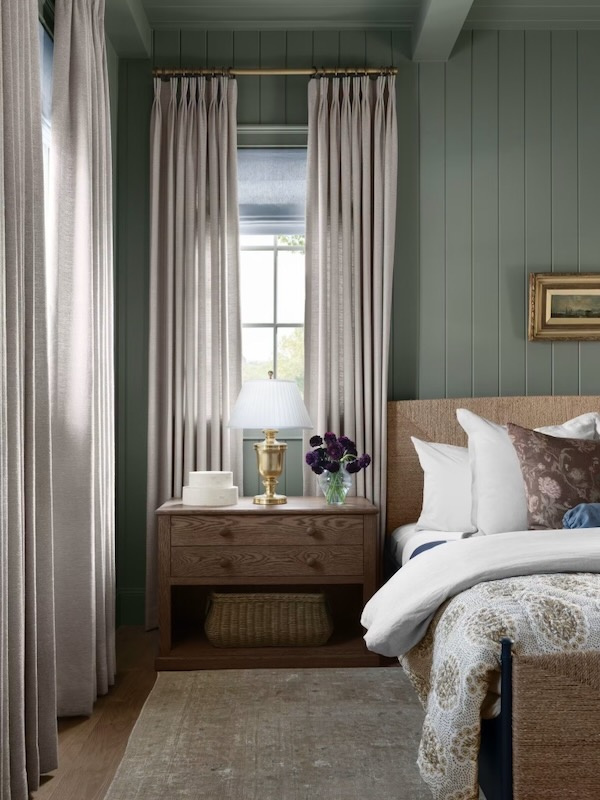
We’re moving away from the idea that a beautiful home needs to rely on either all-neutral rooms or bold statement color.
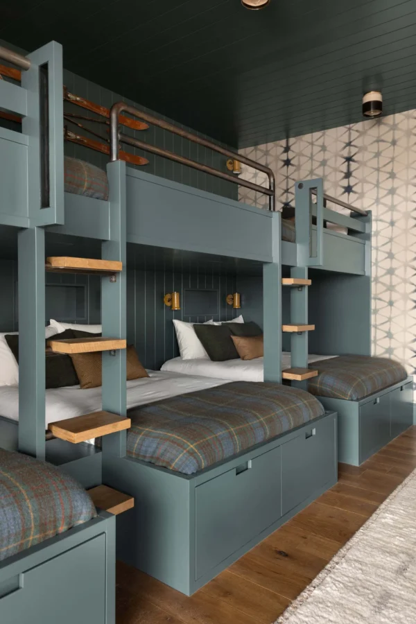
A faded blue can be a neutral. So can olive green. Warm brown can replace black. A dusty rose or soft clay can provide warmth without feeling overtly colorful.
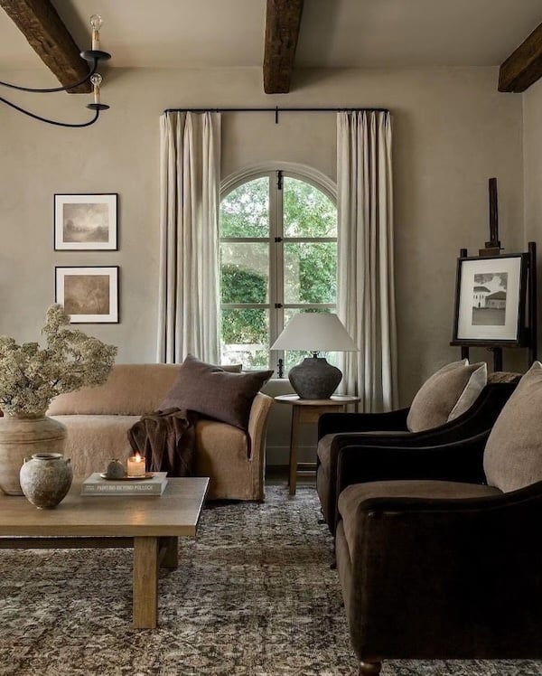 Amber Lewis – Shade Degges Photography
Color is becoming less about following rules and more about creating atmosphere — choosing shades that make a room feel welcoming, restorative, interesting, and uniquely yours.
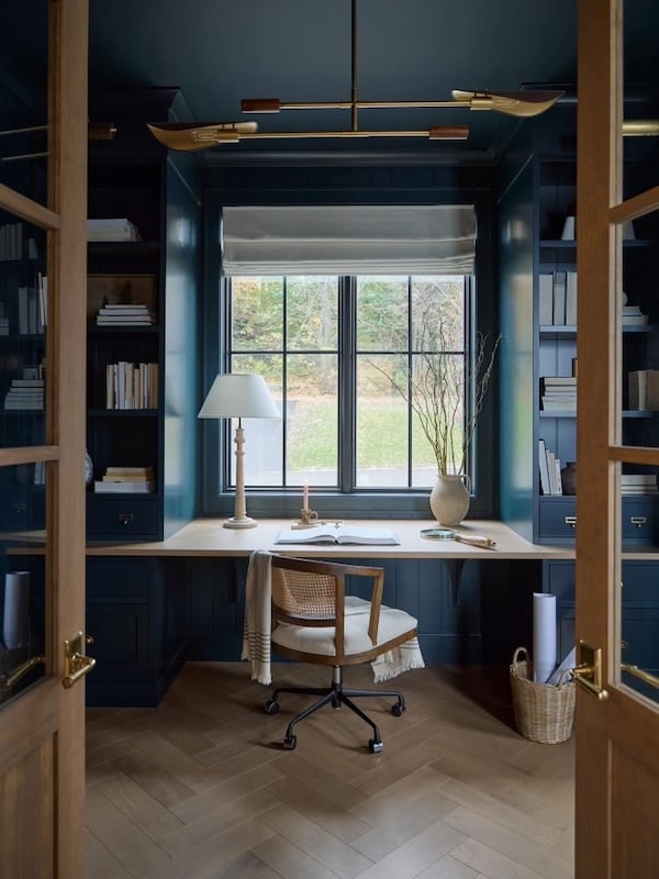 AKB Design Studio – Sylvie Li Photography
As Benjamin Moore and Pantone reveal their 2027 Colors of the Year, I’ll continue updating this post and watching for the common threads connecting all of these palettes.
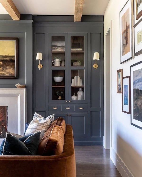 Ali Henrie Design – Lindsay Salazar Photography – sconces – similar sectional
I hope these ideas inspire you to bring a little more warmth, personality, and beauty into your home in the coming year. Have a wonderful day! xo Jane
For a look at 2026 color trends, see my post, 2026 Colors of the Year and Top Home Color Trends.
Looking for more color trends, interior design ideas, and decorating inspiration? Here are a few favorite related posts from the blog:
The Best Bathroom Paint Colors for a Fresh, Timeless Look in 2026
The Most Popular Blue Paint Colors for 2026
2026 Bedroom Color Trends and Decor Ideas You Will Love
Warm White Bathroom Ideas: Timeless Paint Colors and Design Inspiration
Warm White Kitchen Ideas: Timeless Design, Neutral Paint Colors, and Inspiration
12 Reasons Your Home Feels Unfinished (and how to fix it)
The 10 Most Beautiful Home Decor Trends for 2026
Favorite Spaces of the Year: the Most Beautiful Homes Inspiring 2026
Top 10 Interior Design Styles and Trends for 2026
My Favorite Nancy Meyers Inspired Interiors
Modern Coastal Decorating Ideas for Your Home
Bedroom Design Ideas for a Dreamy Master Suite
Beautiful Living Room Ideas and Trends for 2026
Content might contain affiliate links. If you purchase through a link, I may receive a commission at no cost to you. Please see my disclosure policy for details.
No Comments